


Some homes have great bones, but they’re buried beneath decades of dated finishes. That was the case with our Pocket Project — a spacious 1990s home filled with heavy oak cabinetry, brick details, and bold wall colors that didn’t reflect the new owners’ vision.
Our goal? To strip back the excess and reveal a home that felt calm, cohesive, and quietly luxurious. Every surface was reimagined, each space thoughtfully rebalanced. Here’s a look at how we transformed this home from builder-grade to custom sanctuary.
Before: Honey Oak and Heaviness
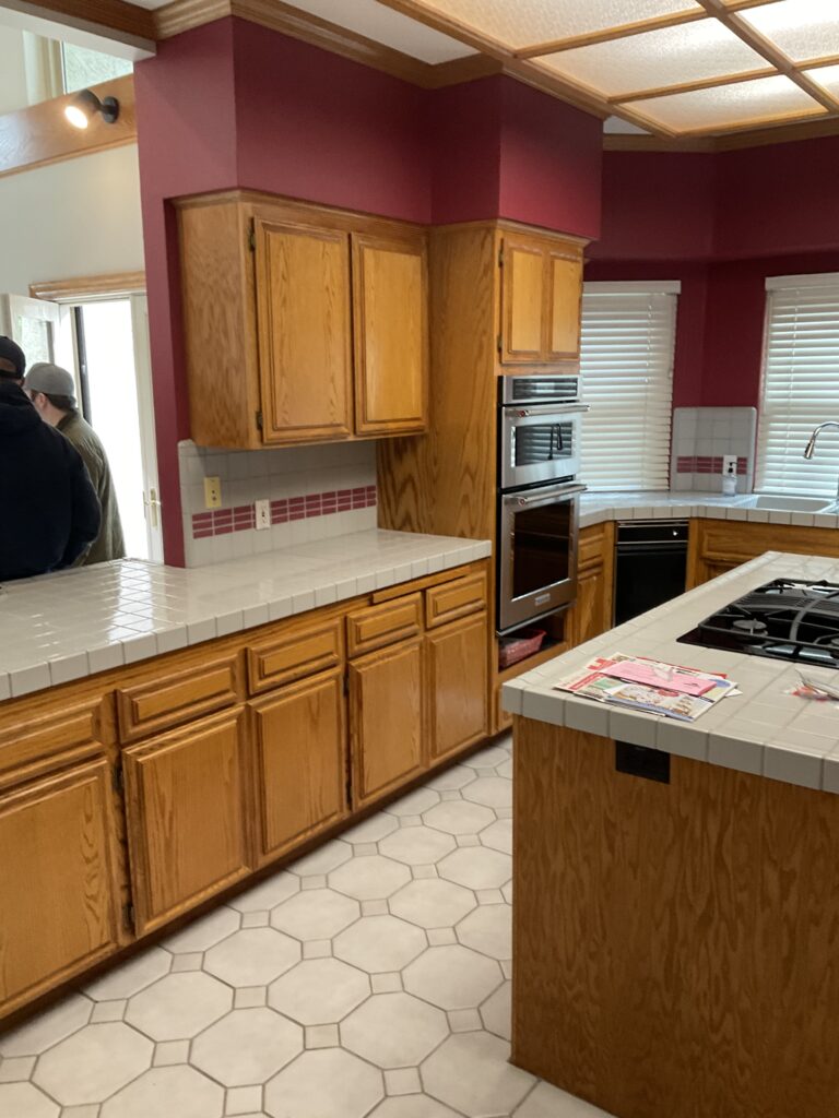
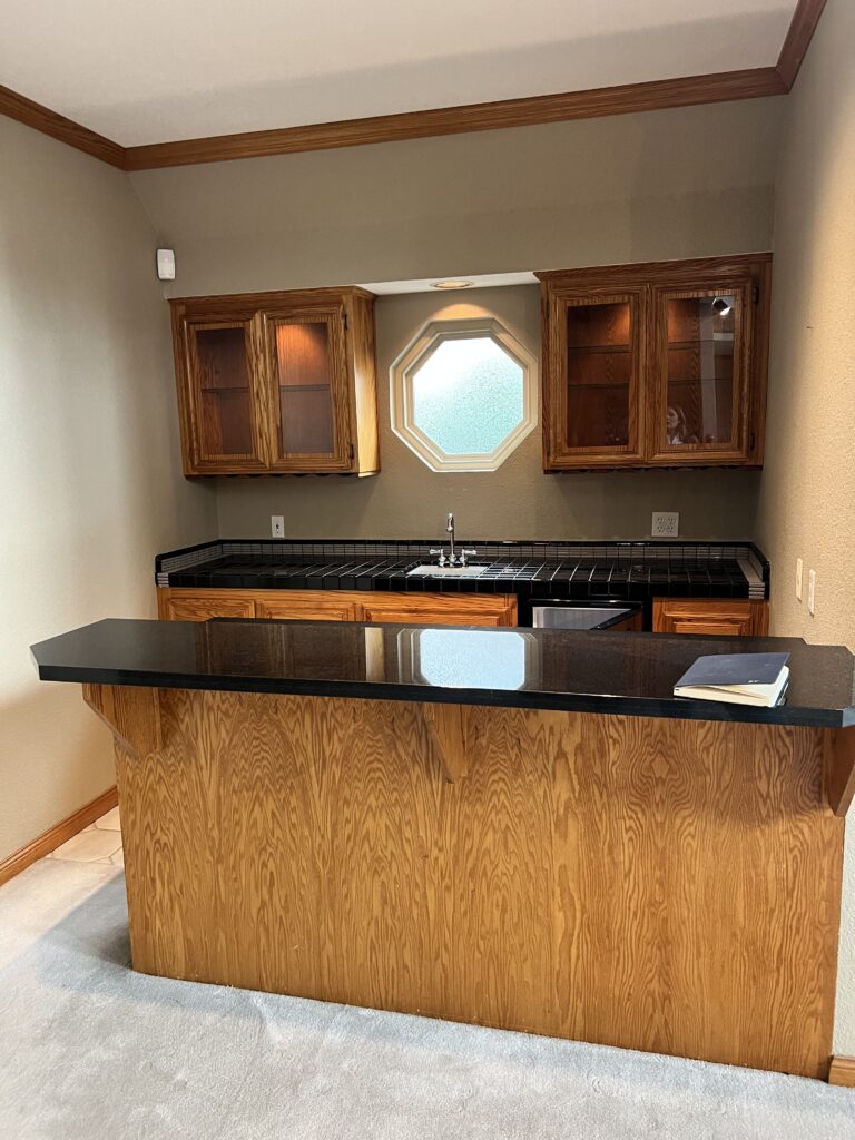
From the moment you walked in, you were greeted by a towering oak fireplace with a busy brick hearth, surrounded by dark cabinetry and thick trim. The kitchen was a sea of tile and red walls, with fluorescent ceiling panels that cast a harsh light over everything. The wet bar, powder bath, and dining room were all wrapped in the same orangey wood tones that dominated the house.
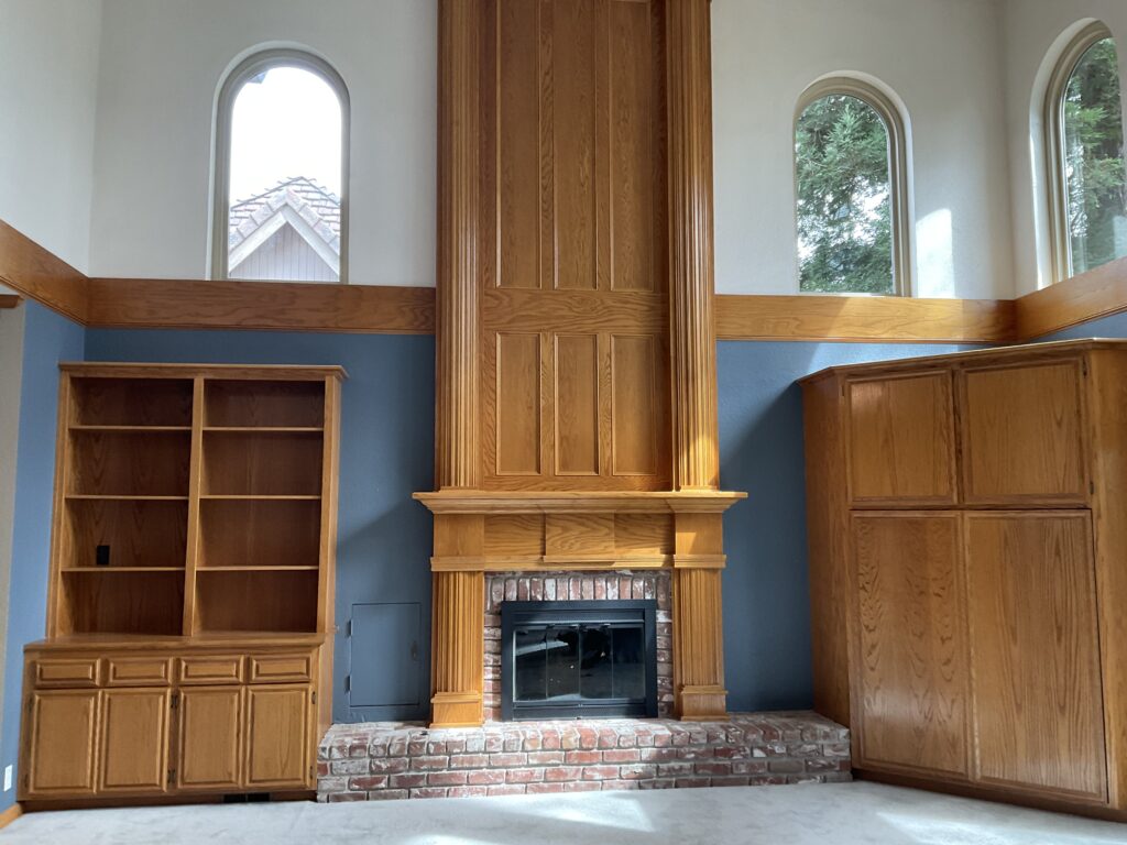
Despite the visual clutter, the home had strong architecture and beautiful natural light. It just needed breathing room — and better materials to let it shine.
The Vision
We approached the design with a clear intent: soften the home’s presence while elevating its materials and layout. We kept the architecture intact but modernized it with:
- A neutral, warm paint palette to create cohesion
- Rich wood tones and textural contrast for depth
- Subtle but sophisticated details like plaster, unlacquered brass, and handmade tile
- A new layout and millwork that respected scale while bringing it into the present
After: Layered, Elegant, and Earthy
Living Room
Gone is the ornate fireplace surround and red brick hearth. In its place, a minimalist plastered fireplace stretches low and wide, flanked by custom built-ins in a warm, dark oak. A linear wood mantle bridges the two — grounding the room while still letting the arched windows and ceiling height breathe.
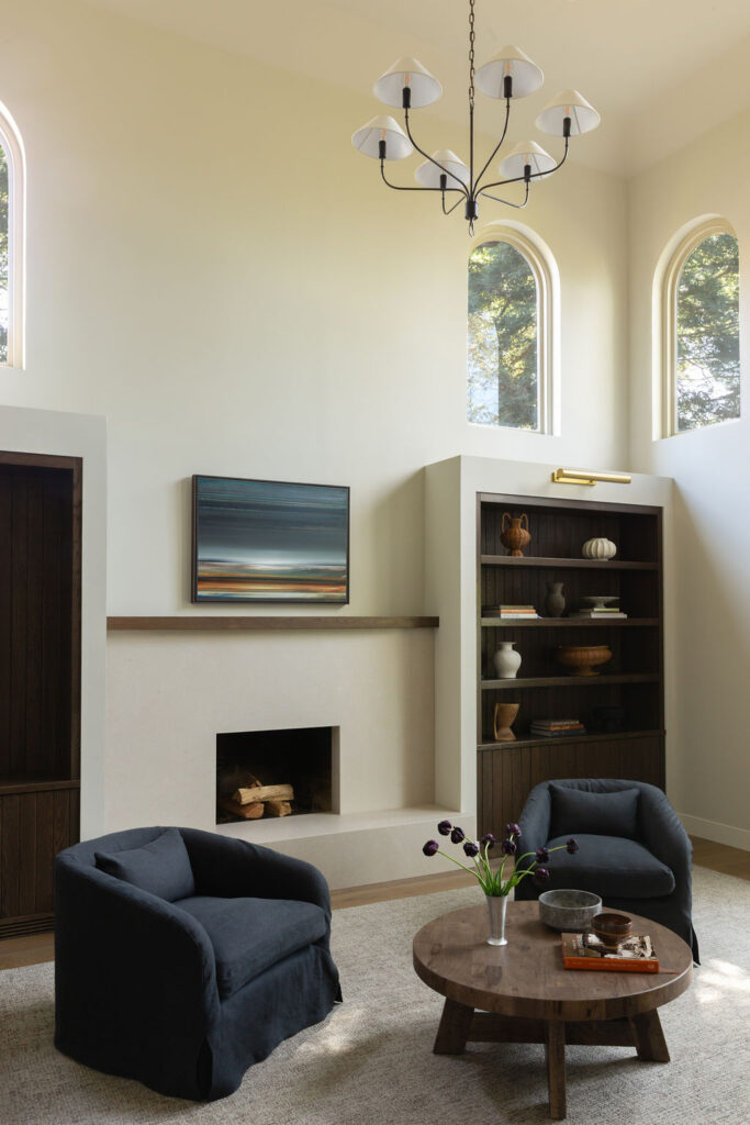
Soft, sculptural furnishings and layered textures make this space feel like a quiet retreat.
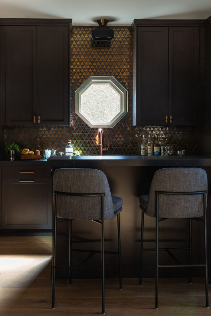
Bar Area
What was once an underutilized and dated corner is now a jewel-box moment. Rich chocolate brown cabinetry, copper hardware, and a bronze-toned geometric tile create a moody, dramatic feel that’s perfect for entertaining. The original octagonal window remains — but now it glows.
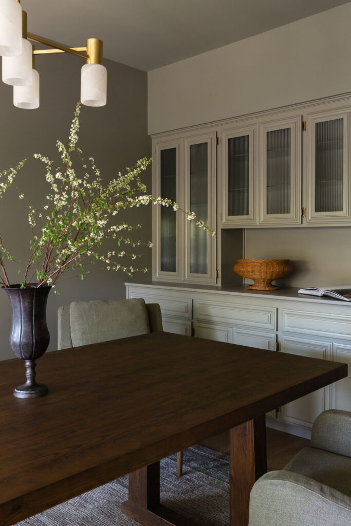
Dining Room
We kept the built-ins but gave them new life with a custom paint color, reeded glass doors, and fresh hardware. It’s a perfect example of updating without replacing — and how cabinetry can be transformed with the right details.
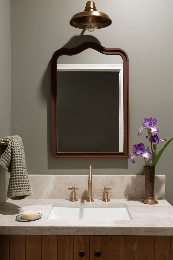
Powder Bath
Wood slat cabinetry and brass fixtures bring character to this small but impactful space. A moody green-gray wall color and vintage-inspired mirror strike a perfect balance of charm and polish.
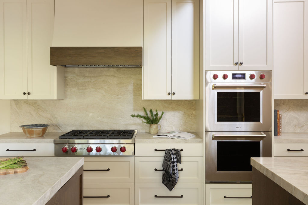
Kitchen
This may be the biggest transformation. We reworked the entire layout and replaced the heavy oak cabinets and tile with two-tone cabinetry in soft putty and rich oak. A creamy quartzite countertop and full-height backsplash add elegance without feeling cold. Every detail — from the cabinet hardware to the plaster hood — was selected for warmth and timelessness.
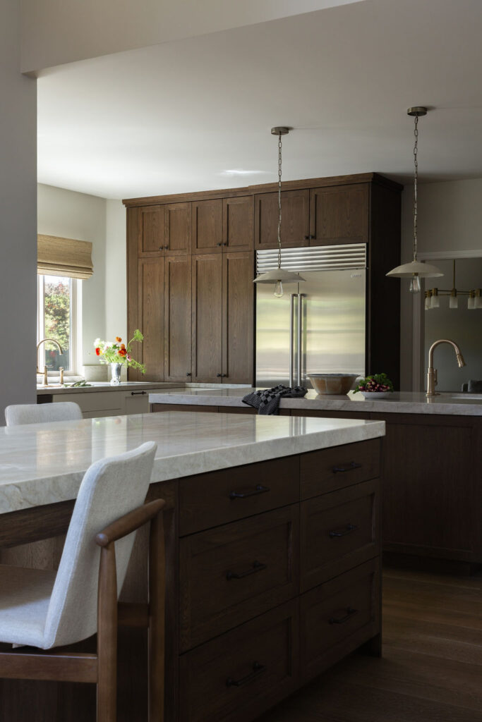
The new kitchen island anchors the space, now open to the living area and full of natural light. It’s functional, elevated, and inviting — everything the original was not.
Final Thoughts
This project proves that even the most dated home can be beautifully reborn with intention and restraint. By prioritizing materials, simplifying forms, and adding soul through texture and tone, we created a home that feels as fresh as it does timeless.
All Photos by Whitney Dianne


